Top things to look at for responsive website design
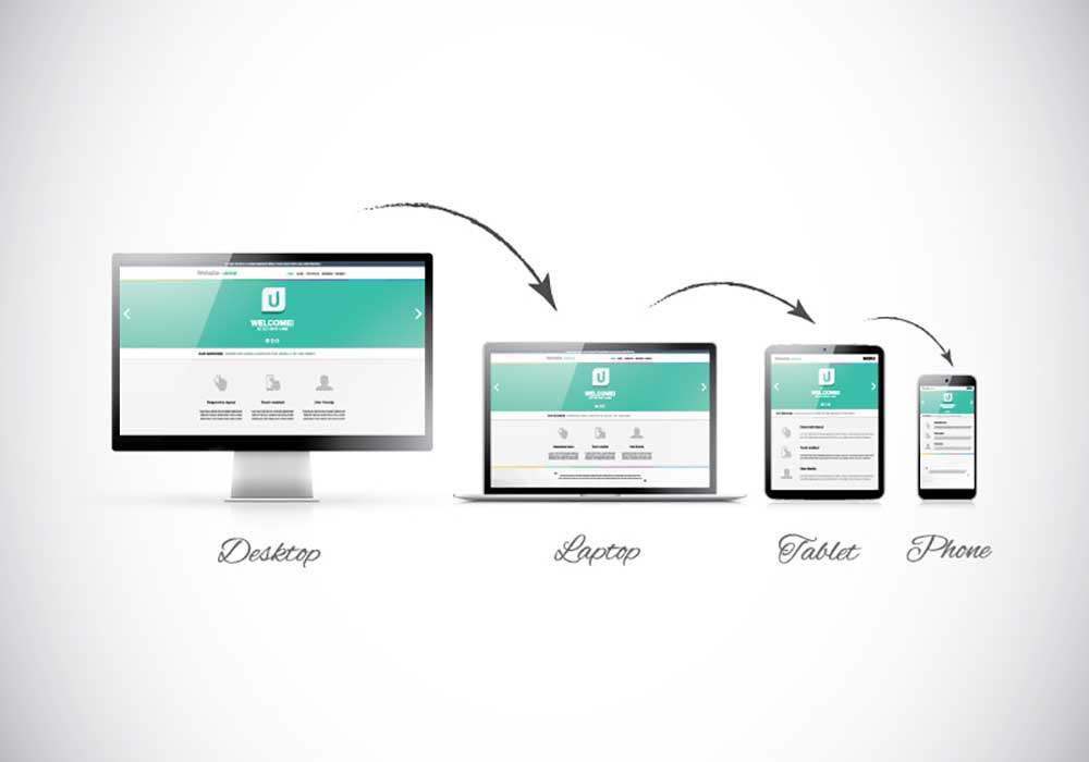
Responsive website design creates sites that will change given a new browser or device. Internet users today are tracked based on their device, their platform and their browser. Responsive websites use this information to immediately change their design to give you a proper viewing experience. The top features of responsive websites are listed below, and you may employ any of these features in your own websites.
#1: Flexible Dimensions
Every website created using responsive design changes shape based on the browser or device you are using. A smartphone screen shows images in much smaller scale than a tablet, and your laptop screen is even larger still. Responsive web design creates images and text that will change sizes to meet the needs of your screen. Every website you visit will scale to your screen immediately if they have used responsive design features.
#2: Flexible Tabs
The tabs on each page change shape and size using responsive design. You have attempted to use desktop sites on your smartphone in the past, and the tabs are not always easy to click. Tabs on responsive websites change their shape, and you may click on these tabs easily on a responsive website.
#3: Flexible Navigation
The top features responsive website design programs include flexible navigation from one page to another. May press the back button on your browser, but the back button may not do what you want it to do. Responsive sites go back and forth properly via the buttons on your browser.
#4: Flexible Sound
Sound and videos on your website must change volume when your readers visit you. Another of the top features responsive website design includes a change in sound profiles for your website. Readers should not hear a single loud noise when they visit your site. All videos and music on your site will drop in volume when users arrive on your site, and a responsive site offers a volume bar for users to change at their leisure.
Responsive website design creates an environment where your readers may enjoy your website from any device or browser. Commission responsive web design when you want to enhance the appearance and experience of your personal or business website.
SHARE THIS BLOG ARTICLE
Blog article information
Blog article date:
18 th
Jun 2015
Posted by M.V
Tags Responsive Website Design
Related service pages
Please use the following links to go directly to our services pages that relate to this blog article.
Mobile Responsive Websites
Website Design London
Website Development London
Back to Blogs